Our final show at college is fast approaching and we have been working on our FMPs for a number of weeks now. At the beginning of my previous unit, I decided to merge it with our final unit so I had longer to explore my themes and pull my experiments together.
As a whole, I am exploring our relationships with 'stuff' and objects and the psychology behind this. I have touched on Obsessive Compulsive Hoarding as a psychological disorder and looked at the textures and aesthetics of something a majority of people touch and collect most days of our live - plastic. After starting to look at individual 'prized possessions', I realised that most people in our current materialistic society cannot chose just one thing they treasure and we all have too many things in our lives in general. But there is also a need to have so many things with life taking so many directions at once and becoming so fast-moving; unlike a society decades ago where most possessions were born out of basic functionality or sentimentality.
Sunday, 21 May 2017
Friday, 10 February 2017
Transformations
The new unit focuses on drawing and photography under the term Transformations. This can mean process-wise or to do with the subjects we explore, so I am not going to worry about fitting the term into my work just yet and see where my experiments and work take me. I would like to carry on the theme of homes and identity, looking at the objects people hold dear to them and why. What objects make our homes feel like ours, excluding or including furniture? I would like to talk to a range of people about their prize possessions and objects, producing illustrations, drawings, photographs and manipulated photographs before moving on to more 3D work, hopefully resulting in glass or ceramic houses with photographs and drawings wrapped around them. I would like to experiment with fabric, acetate and printmaking but gradually move into more 3D work, something I feel my portfolio is lacking in. I am excited for this project and happy to have worked out parts of my theme before immersing myself in the work, something which has held me back and prevented me from finishing units in the past.
So far in class, we have started life drawing sessions every Monday morning, produced lichtfaktor photography (light paintings), experimented with still life drawing objects wrapped in plastic and manipulated photographs with fire, scratching, bleach and collage. I find it extremely helpful to do work within the class organised by my tutor as it gives me a chance to build some techniques and establish ideas.

One of my sheets from life drawing (will update with more). 1x 20 minute pose and 2x 15 minute poses. I am extremely pleased with these studies and will be practising over the coming weeks in preparation for more sessions.


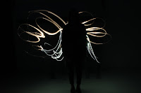


We recently produced a number of Lichtfaktor photographs using a variety of different light sources. Through a long exposure we were able to use phone lights, torches, strings of fairy lights, coloured screens and headlamps to create intricate and energetic photographs. Our confidence grew as we experimented more and ended up producing crazy impressionist-style images with lines dancing across every inch of the frame. It would be interesting to produce images like this for my studies of objects and their purposes.


The object I chose to study was an old film camera. I wrapped it in placates quite tightly because the forms of the camera were something I didn't want to lose. When I accepted the fact I wasn't able to draw the objects extremely accurately I chose to go down a much more experimental route, using ink, oil pastel, pens and pencil. The childish style is something I studied in my last unit and this translated into this work, with vibrant colours and inaccurate lines and shapes. Until I chose to draw a blue line around the plastic form, the shapes did look vaguely plastic-like however the blue line ruined that and turned the image into a very map-like design. The camera is related the my theme as I want to look at objects.


When manipulating photographs, I chose to use old photographs that had gone wrong, end of roll images and duplicates from the many disposable and film camera film roles I've had developed. A lot of images just had block colour, some had images which had gone wrong or been double exposed by accident and some were duplicates that I'd received. I used bleach, burning, collaging and scratching to produce these images which I think have worked very well. I especially like the images which have had shapes cut out and swapped with other images. For me, they speak of memories and could possibly be linked to Gerhard Richter's overpainted photographs were by painting over the image he obscures the memory from a family holiday for example. The bleach also worked well, though it was not a destructive as I thought it would be and I had to work it in for a long time before seeing results. The burning worked well, especially in the image of the peaceful landscape. I burned the centre leaving a huge dark, smoking hole in this peaceful, tranquil image.


After collaging with some other images, I chose to use some images which were pure colour to draw on and slice up so I could experiment with compositions and switching sections around. I think these work well and are very graphic. With the first one I brought in a drawing of a chair to bring it back to my subject matter before obscuring that drawing to the point of total abstraction. The colours and layouts are aesthetically pleasing and I will be exploring this technique in the future.
I will continue to experiment with a variety of different processes and document them as best I can. I want to eventually narrow down techniques and bring them in to a developed body of work consisting of photography, manipulated photography, experimental contemporary drawing, combinations of drawing and photography and sculptural work.
Nelle
So far in class, we have started life drawing sessions every Monday morning, produced lichtfaktor photography (light paintings), experimented with still life drawing objects wrapped in plastic and manipulated photographs with fire, scratching, bleach and collage. I find it extremely helpful to do work within the class organised by my tutor as it gives me a chance to build some techniques and establish ideas.

One of my sheets from life drawing (will update with more). 1x 20 minute pose and 2x 15 minute poses. I am extremely pleased with these studies and will be practising over the coming weeks in preparation for more sessions.


We recently produced a number of Lichtfaktor photographs using a variety of different light sources. Through a long exposure we were able to use phone lights, torches, strings of fairy lights, coloured screens and headlamps to create intricate and energetic photographs. Our confidence grew as we experimented more and ended up producing crazy impressionist-style images with lines dancing across every inch of the frame. It would be interesting to produce images like this for my studies of objects and their purposes.


The object I chose to study was an old film camera. I wrapped it in placates quite tightly because the forms of the camera were something I didn't want to lose. When I accepted the fact I wasn't able to draw the objects extremely accurately I chose to go down a much more experimental route, using ink, oil pastel, pens and pencil. The childish style is something I studied in my last unit and this translated into this work, with vibrant colours and inaccurate lines and shapes. Until I chose to draw a blue line around the plastic form, the shapes did look vaguely plastic-like however the blue line ruined that and turned the image into a very map-like design. The camera is related the my theme as I want to look at objects.


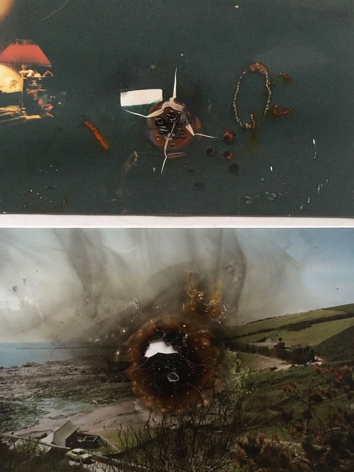


When manipulating photographs, I chose to use old photographs that had gone wrong, end of roll images and duplicates from the many disposable and film camera film roles I've had developed. A lot of images just had block colour, some had images which had gone wrong or been double exposed by accident and some were duplicates that I'd received. I used bleach, burning, collaging and scratching to produce these images which I think have worked very well. I especially like the images which have had shapes cut out and swapped with other images. For me, they speak of memories and could possibly be linked to Gerhard Richter's overpainted photographs were by painting over the image he obscures the memory from a family holiday for example. The bleach also worked well, though it was not a destructive as I thought it would be and I had to work it in for a long time before seeing results. The burning worked well, especially in the image of the peaceful landscape. I burned the centre leaving a huge dark, smoking hole in this peaceful, tranquil image.


After collaging with some other images, I chose to use some images which were pure colour to draw on and slice up so I could experiment with compositions and switching sections around. I think these work well and are very graphic. With the first one I brought in a drawing of a chair to bring it back to my subject matter before obscuring that drawing to the point of total abstraction. The colours and layouts are aesthetically pleasing and I will be exploring this technique in the future.
I will continue to experiment with a variety of different processes and document them as best I can. I want to eventually narrow down techniques and bring them in to a developed body of work consisting of photography, manipulated photography, experimental contemporary drawing, combinations of drawing and photography and sculptural work.
Nelle
Wednesday, 8 February 2017
Pattern in Art Update and Contemporary Traces of Memory
Unfortunately I didn't post to this blog as regularly as I would have liked too during the duration of my last unit, pattern in art. I got so involved in the work with printmaking and drawing experiments and research that I found myself without the time to update this site. Now I am moving into my new unit, I will be looking at drawing and photography and hope to post my work and ideas to this blog to help keep my head organised as I already feel myself struggling to concentrate.
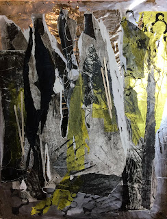
Within the last unit, I chose to explore memory - specifically the childhood memories of my grandad's home and the destruction of this home after it was sold last year following his death. I used self-portraits and symbols to show these memories and the passing of time, experimenting with printmaking, drawing, painting and contemporary mark-making as well as various surfaces such as paper, acetate, acrylic and tissue paper. My final two pieces had a strong narrative when read like a book which is what I intended from the beginning when I was inspired by artists such as Jean-Michel Basquiat, Cy Twombly and Julie Mehretu. They showed my story from young to old, my childhood memories from the home, losing my grandfather, and me reflecting on the loss of these memories with the destruction of the home, ending with the complete destruction. It was an extremely persona subject matter and hard to properly discuss with my tutor and classmates, however I feel I finally put my ideas across with the finishing of my two developed pieces.
With the next unit, the subject is Transformations, which can be process-wise or subject matter. I am currently working out some ideas I would like to explore in this unit and will update regularly with exploration, experiments, research and work.
Nelle
Within the last unit, I chose to explore memory - specifically the childhood memories of my grandad's home and the destruction of this home after it was sold last year following his death. I used self-portraits and symbols to show these memories and the passing of time, experimenting with printmaking, drawing, painting and contemporary mark-making as well as various surfaces such as paper, acetate, acrylic and tissue paper. My final two pieces had a strong narrative when read like a book which is what I intended from the beginning when I was inspired by artists such as Jean-Michel Basquiat, Cy Twombly and Julie Mehretu. They showed my story from young to old, my childhood memories from the home, losing my grandfather, and me reflecting on the loss of these memories with the destruction of the home, ending with the complete destruction. It was an extremely persona subject matter and hard to properly discuss with my tutor and classmates, however I feel I finally put my ideas across with the finishing of my two developed pieces.
 |
| 1/2 Contemporary Traces of Memory |
 |
| 2/2 Contemporary Traces of Memory |
Nelle
Monday, 5 December 2016
Pattern in Art
Deconstruct/Reconstruct has been handed in (I created Richard Prince inspired collages aiming to disrupt voyeuristic viewing pleasures) and our new brief is Pattern in Art.
We've been brainstorming physical and conceptual patterns and been looking at various use of pattern in art history, especially Abstract Expressionist and billboard artists who use ripping and tearing in their work. In response to these works, we spent a day reacting to materials and creating interesting mixed-media works by collaging, printing, ripping and painting. I created two works, on mirrored backgrounds.

I used old screen and monograph prints, tissue paper, crepe paper and black acrylic paint to print on top with egg cartons and coffee sticks. I also stuck coffee sticks on top in various places to give the work some low relief, all of this on top of a mirror paper background. As I stuck things on and ripped them off again, I enjoyed the small glimmers of my reflection and the light on the surface of the mirror, it added an interesting new element to the work and provided depth. To me, these works provoke a nostalgic feeling; the simple colour scheme and varying shapes and textures remind me of old photographs, while the egg-carton prints look like toys and trinkets. I am extremely pleased with these works, having been interesting in Abstract Expressionism for a long time and rarely having the opportunity to respond to this period in art history. I enjoyed the technique of ripping and tearing and will explore these in my future work for the brief.
In a workshop with a photography technician, we embarks on learning about and creating photograms; camera-less photos, made my exposing light-sensitive photographic paper to light with objects placed on top. The technique was developed by Man Ray, whose work I have researched and have come to adore. I used a huge variety of things such as glass cubes, foliage, netting, glass gravel, linear things such as coffee sticks, my own hair, wire, pom poms and teabags. At the end of the day I had created a large number of these prints and developed my own style. I returned the next day to compose thought out images of flowers and planets using items I had collected. I will upload images when I have chosen a small number to photograph.


For this image, I found large HD images of the Antarctic in a magazine and stapled four together on top of each other. I then sliced an image of a polar bear into the top one, removing the layers underneath that had been cut by the blade. I was hoping to comment on the decline in polar bears and on global warming, by removing the pieces and camouflaging the creature, this provokes the feeling of loss and disappearance, which is what is happening to the population of polar bears.
Mixed Media Work
We've been brainstorming physical and conceptual patterns and been looking at various use of pattern in art history, especially Abstract Expressionist and billboard artists who use ripping and tearing in their work. In response to these works, we spent a day reacting to materials and creating interesting mixed-media works by collaging, printing, ripping and painting. I created two works, on mirrored backgrounds.


I used old screen and monograph prints, tissue paper, crepe paper and black acrylic paint to print on top with egg cartons and coffee sticks. I also stuck coffee sticks on top in various places to give the work some low relief, all of this on top of a mirror paper background. As I stuck things on and ripped them off again, I enjoyed the small glimmers of my reflection and the light on the surface of the mirror, it added an interesting new element to the work and provided depth. To me, these works provoke a nostalgic feeling; the simple colour scheme and varying shapes and textures remind me of old photographs, while the egg-carton prints look like toys and trinkets. I am extremely pleased with these works, having been interesting in Abstract Expressionism for a long time and rarely having the opportunity to respond to this period in art history. I enjoyed the technique of ripping and tearing and will explore these in my future work for the brief.
Photograms
Cuttings and Collages
Today we have been folding, slicing and pasting images and paper to create work. Our first task was to fold and cut patterns into paper.


I chose to create quite a structured pattern by folding the paper in half longways twice and carving long and short slits in different directions, but mainly down the page instead of across. The results were quite floral and intricate. Paired with different coloured backgrounds I felt they were strong pieces of work.


For these fun images I found pictures of Queen Elizabeth in a magazine and cut out a sort of Basquiat/Keith Haring crown above her head in each one, putting yellow behind it. I then pasted cut out slices from other peoples work that were left over around her to fill the space. The results are fun and made use of off-cuts of paper and magazines.

Tuesday, 18 October 2016
Cubist Painting
After a lecture about colour theory and mixing and looking at examples in cubist art history, were asked to create cubist-inspired paintings using acrylic paint and a design made from objects we either made or found.
I chose to draw a design from a headless, armless, torso mannequin of a woman I found at the back of the classroom. The object was white and had interesting angles. I chose to copy the technique I used to draw a design for a sculpture and overlay drawings of the torso from different angle to create spaces and shapes in the image. I am pleased with how the initial drawing came out and was worrying about ruining it with acrylic paint.


Nelle
I chose to draw a design from a headless, armless, torso mannequin of a woman I found at the back of the classroom. The object was white and had interesting angles. I chose to copy the technique I used to draw a design for a sculpture and overlay drawings of the torso from different angle to create spaces and shapes in the image. I am pleased with how the initial drawing came out and was worrying about ruining it with acrylic paint.
 |
| My initial pencil drawings/design |


After I'd created my base design, I decided to block in vibrant warm colours; reds, oranges, pinks and yellows after picking out definite shapes. I hope to paint the entire image in this way and create an abstract, jumble of shapes and colour. When the painting is finished I will upload an image
 |
| The mannequin I was drawing from at different angles |
EDIT: I finished painting the piece, purposely leaving middle areas white to pull focus to the centre and to not over-do the painting.

Glazing Ceramics
Yesterday we had another ceramic session with the technician, Fran, where we glazed our small hand-built pieces and turned some of our thrown pieces on the wheel. I have turned pots before and it has never turned out well and yesterday's session was no different; I turned one of my leather-heard pots but the glaze ring was far too large and the pot didn't look great.
When glazing my slab, pinch and coil pieces, I found a beautiful turquoise-green bucket glaze which I covered all three in, with plans to draw on-top in a Jean-Michel Basquiat inspired way with ceramic crayons. Upon discovering that the crayons wouldn't work on top of the glaze, I scratched and indented the thick layer of turquoise with Basquiat qualities in the hope it would create some interesting textures. I left my slab pot plain turquoise on advice from the technician and scratched lines into the pinch pot similar to the lines left in the clay underneath.
When coming up with Basquiat-inspired designs I jotted down words that came to mind when looking at it to scratch into the surface which I didn't end up using but found to be an interesting thought-generating technique.


EDIT: The works have all been fired and the turquoise colour I used on all three looks fantastic. Deep, smooth and unique on each form.


Thursday, 13 October 2016
Deconstruct/Reconstruct
This week we received our first official brief, the theme is Deconstruct/Reconstruct. A lot of the base ideas our tutor Pam wanted us to research revolved around cubism, the artists involved in the historical movement and cubism's effect on art since and today. Our outcomes don't have to be directly linked to cubism, just the very wide subject of deconstructing and reconstructing something. There are many different paths to go down, possible subjects and themes to explore and a lot of research, historical and contemporary, to be done.
Before we received the brief, we had an art history lecture about cubism and the importance of the movement and were asked to produce collages with a 'cubist approach' out of photocopied images, magazine pages, old screen-print textures etc.


Before we received the brief, we had an art history lecture about cubism and the importance of the movement and were asked to produce collages with a 'cubist approach' out of photocopied images, magazine pages, old screen-print textures etc.

I made three collages with different themes (will upload photos once I have taken more). I was extremely happy with all three of them. It was exciting to see themes and ideas unfold from the placement of collage pieces and building on those themes. I do think I slightly swayed from the 'cubist approach' but my ideas and processes were definitely within the deconstruct/reconstruct theme.
I am a huge fan of collage and appropriating images and will definitely be using the techniques in this exciting new brief
EDIT:
The images of the other two collages I completed in class. I used similar images plus my own cut out pieces from the fashion magazine Peacocks and Pigeons


Throwing and Cubist Sculptures
Last week we started our Monday sessions in the ceramics department. We created slab pots (inspired by cubism), pinch pots and a slab-coil pot (will upload photos when I have them). I spent a lot of time in ceramics over my the duration of my last course so knew how to make these shapes, but it was extremely helpful to be re-taught the techniques by a new, better technician.
This week we were in the throwing room, something which again I have done many times before. I hadn't thrown in a long time and was extremely rusty to begin with but the technician, Fran, helped a lot and got better as the day went on.


This week we were in the throwing room, something which again I have done many times before. I hadn't thrown in a long time and was extremely rusty to begin with but the technician, Fran, helped a lot and got better as the day went on.


After we had thrown (I created three pieces I was happy with), we were asked to create a design for a plaster sculpture inspired by cubism (to do with our brief we were let to receive). To come up with the designs we gathered random objects in the studio, arranged them and draw the shapes from many different angles, layering the drawings on top of each other.


I chose to draw each layer in a different colour do I could easily differentiate between the shapes and layers. I was pleased with how the drawing turned out and enjoyed making it; I would like to develop this technique in the future. The sculptures were to be made from card, plastic, wire etc. and covered in plaster. I didn't get round to making the sculpture itself but will do so when I get some free time at college and will upload pictures once it's been built
Subscribe to:
Comments (Atom)